CHAPTER 01 : APPLICATION OF STATISTICS IN GEOGRAPHY
Definitions of Statistics
- Statistics is the practice or science of collecting and analyzing numerical data in large quantities, especially for the purpose of inferring proportions in a whole from those in a representative sample.
- Statistics is the discipline that concerns the collection, organization, analysis, interpretation and presentation of data.
- Statistics is a branch of mathematics dealing with the collection, analysis, interpretation, and presentation of masses of numerical data
-Statistics is the science that deals with the collection, classification, analysis, and interpretation of numerical facts or data, and that, by use of mathematical theories of probability, imposes order and regularity on aggregates of more or less disparate elements.
- Statistics is an information based on a study of the number of times something happens or is present, or other numerical facts.
- Statistics is the study of collection, analysis, interpretation, presentation, and organization of data. Data refers to crude or uninterrupted information.
- Statistics is the study of methods of collecting, summarizing, analyzing and presenting data in a clear and understandable way by using numbers.
|
|
| Statistics |
Data are exact numerical facts collected systtematically and arranged for a particular purpose. Data may be obtained from official sources, government publications, ministry bulletins and international bureau statistics.
Sources of Geographical Data
There are two sources of geographical data which include primary sources and secondary sources.
1.Primary Sources of Geographical Data
These are the data obtained directly from the field through questionnaires, observation, interviews, tests and focus group discussion.
2.Secondary Sources of Geographical Data
These are the data obtained from libraries, magazines, newspapres, published or unpublished documents such as books, journals, maps and other public documents.
Types of Statistical Data
1. Discrete Data: are data which can not take any value within a given set but can only represent a whole number like people and animals, cars, house, livestock, etc. E.g: There were thirty students students or thirty one students
2. Continuous Data: these are data which can take any value within a set of a given number. These values have fractions and decimal points. Continuous data include those data whose values can be measured like temperature, altitude, height, etc. E.g: 25°C, 680m.
3. Individual Data: these are data provide precise, specific and exact value for each individual item in a sample gicen. Every individual represents its own value. For instance in Vituka High School comprises of five streams A, B, C, D, E and each stream has 45, 63, 42, 51, 51 students respectively. Each figure is thus an exact value for a given class.
4. Grouped Data: this represent a group of value or class which may fall under one value or class in with no exact figures are quoted but where several values fall within certain classes or groups.
Variable
A variable is anything or characteristic that data may have, or an attribute which changes in value under given conditions. Variables include population size, age, sex, altitude, temperature and time. Variable can be classified into two major forms:
1. Anindependent variable is a variable factor which influences the changes of other variables or outcomes eg. Sex, year etc. it is expressed on the x-axis. The independent variable is also known as manipulated variable.
2. Adependent variable is an outcome or result that has been influenced by other variables. A dependent variable does not influence or change other variables. The dependent variable responds to independent variable. It is called dependent because it “depends” on the independent variable. For example the higher the attitude the lower the temperature and vise versa, for that reason increase or decrease of temperature depends on attitude.
WAYS OF PRESENTING DATA
Data can be presented in several ways. These include pictorical charts, block diagrams, tables, graphs and maps. This study focuses on bar graphs and line graphs.
BAR GRAPHS AND LINE GRAPHS
Threre are various types of bar and line graphs used to present geographical data. The main bar and line graphs include:
1. Simple bar and line graphs
2. Grouped bar and line graphs
3. Copmpound bar and line graphs
4. Divergent bar and line graph
A)LINE (LINEAR) GRAPHS
Line graphs have unique properties that distinguish them from other graphs. The properties of line graphs are as follows:
1. The graphs are drawn by plotting a dependent variable against an independent
variable and points are joined by a line.
2. The values on the y-axis start at point zero.
General Procedures for Drawing Line Graphs
1. Get the required data for plotting the graph.
2. Identify the independent and dependent variable. Statistically, the independent variables are placed on the x-axis while the dependent variables are placed on the y-axis.
3. Decide on the vertical scale depending on the graph space and values of the
independent variable available.
4. Decide on the horizontal spacing of the graph according to graph space available.
5. Draw and divide the vertical and horizontal axes depending on the respective scales.
6. Plot and join the points to get the graph.
7. Write the title of the graph you have drawn.
8. Indicate the scale of the graph.
9. Show the key for the graph if need be.
Line Graphs can be sub-divided into:
1. Simple line graphs
2. Group (comparatives) line graphs
3. Compound line graphs
4. Divergent line graphs
1.SIMPLE LINE GRAPH
Presenting the statistical data by a simple line graph is the most common and popular method. The simple line graphs are easy to construct and interpret. They have many uses which include showing temperature, farm outputs, population, and mineral production, among others.
Construction Procedure:
The graph can be drawn after getting the required data. Consider the following table which shows the average monthly temperature recorded in a certain weather station:
Average monthly temperature for station X
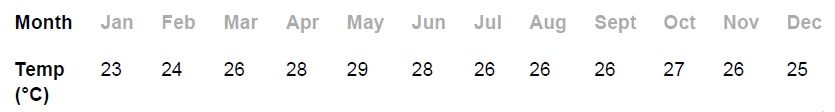
The following procedures may be used:
1. Identify the variables. The dependent variable is temperature and the independent variable is months.
2. Determine a vertical scale. Assume that the graph space available is 6 cm vertically. Vertical scale = maximum value of the divided by the graph space available e.g. 30°C/6 cm = 5°C per centimetre. Therefore, in the vertical axis (xaxis), 1 cm will represent 5°C
3. Determine the horizontal scale (y-axis) depending on the available space. Let, for instance, 1 cm represent one month.
4. Draw both axes and label them: y-axis for temperature and x-axis for months.
5. Plot the points and join them by a smooth line to make a curve.
6. Insert the title and scale.
|
|
| Simple Line Graph showing Monthly Temperature for StationX. |

Scale
Vertical – 1 cm:5°C
Horizontal – 1 cm:1 month
Advantages of Simple Line Graphs
1. They are easy to draw, read and interpret.
2. They show specific values of data, so if you are given one variable the other can easily be determined.
3. They show patterns in data clearly, meaning that they visibly show how one variable is affected by the other as it increases of decreases.
4. They enable the viewer to make predictions about the results of data. So they allow for determination of intermediate or continuing values.
5. It is easy to read the exact values against plotted points on straight line graphs.
6. A broken scale can be used when the value starts at a large number.
Disadvantages of simple line graphs
1. They can only be used to show the data of one item over time.
2. One can change the data of a line graph by not using consistent scales on the axis.
3. They can give a wrong impression on the continuity of data even when there are periods when data is not available.
4. They do not give a clear visual impression of the actual quantities.
2.GROUP LINE GRAPH
A group line graph is also known by the following terms:
- Comparative line graph
- Composite line graph
- Multiple line graph
- Polygraph
A group line graph involves drawing more than one line on the same statistical
graph. It shows the relationship between sets of similar statistics for two or
more items.
Usefulness of a Group Line Graph
1. Comparing different values or trends in two or more data variables.
2. Examining the possibility of a relationship existing between the distributions of
a number of variables over time.
3. Comparing the distribution of the same variable at different places.
Construction:
The method of drawing a group line graph is the same as for a simple line graph. Therefore, to draw each single line in a group line graph, follow similar steps used for construction of the simple line graph.
The following things should be considered before drawing the graph:
1. The lines drawn should not be uniform in colour, thickness, general appearance, etc (See the graph below in which each line has a different colour).
2. The number of lines that a graph can accommodate should not exceed 5, meaning that not more than 5 items should be compared in a single graph.
The following table shows banana production (in tonnes) by three villages in Ingwe Division, Tarime district. These data have been used to plot the group (comparative) line graph as shown below:
Banana production by three villages
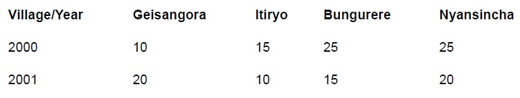
|
|
| Group Line Graph showingMaize production by three villages between 2000 and 2002 |

Advantages of Group Line Graph
1. The quantity of each component is shown clearly by different line shadings.
2. Time and space are saved since all the line graphs are drawn at ago as a group.
Disadvantages of Group Line Graph
1. The lines can be overcrowded and hence become difficult to read and interpret if many data are involved.
2. It does not give a clear visual impression of actual quantities.
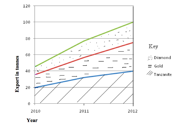
3.COMPOUND LINE GRAPH
A compound line graph is used to analyse the total and the individual inputs of the specific commodities or economic sectors. The graph involves drawing two or more lines, each line corresponding to one item in a different year or region. The items are differentiated from each other or one another by shading differently.
Construction
The table below is used for construction of the graph. The table contains hypothetical figures for mineral exports between 2010 and 2012.

Procedure
1. Simplify the data to make the presentation work easy by dividing each value by 1000.
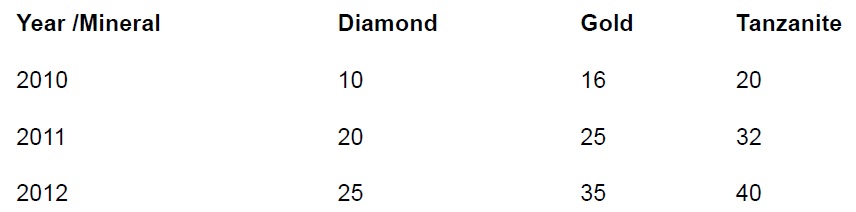
2. Add the values for each year to get the cumulative export:
2010 = 10+16+20 = 46
2011 = 20+25+32 = 77
2012 = 25+35+40 =100
These values will be used to determine the uppermost height of the graph. They will also help estimate the scale to be used. In case of the above data, the highest value is 100. So if we want to use the scale of 1 cm to 1 tonne (1000 tonnes in reality), the uppermost height of our graph will be 100 cm (see the graph drawn)
3. Plot the values for mineral exports against years on a graph. Usually the line graph for data with the highest values is drawn first. Thus, first draw the line graph for tanzanite since it has the highest values, followed by that of gold and finally diamond.
4. Draw the second line graph above the first one to show the next component. To get the values for plotting the second line graph, add the values of the first item (in this case, tanzanite) to that of the second item (gold) for each year, thus:
2010 = 20+6 =36
2011 = 32+25 =57
2012 = 40+35 =75
5. Draw the line graph for the last item (diamond) above that of the second item. To get the values for plotting this graph, add the values for the second item to those of the last item, thus:
2010 = 36+10 =46
2011 = 57+20 =67
2012 = 75+25 =100
6. Shade the component parts between the line graphs using different shadings
as shown.
7. Label the axes, show the key and indicate the scale used to construct the
graph.
|
|
| Compound Line Graph Mineral Exports between 2010 and 2012 |
Advantages of Compound Line Graph
1. Total values are shown clearly and easily.
2. It gives good visual impression.
3. Combining all graphs in one saves time and space.
Disadvantages of Compound Line Graph
1. Graph construction is difficult and time-consuming.
2. It involves a lot of calculations which are difficult and time-consuming.
3. It is difficult to read and interpret the value for any one commodity for any particular year.
3.DIVERGENT LINE GRAPH
A divergent line graph is a line graph which shows how variables deviate from the mean. The mean is represented by zero axis drawn horizontally across the graph paper.
Construction
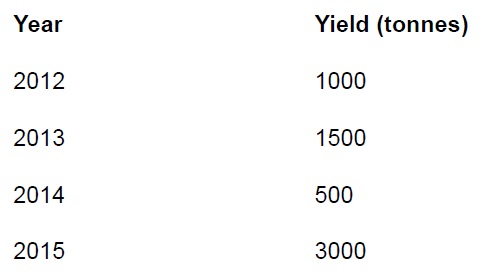
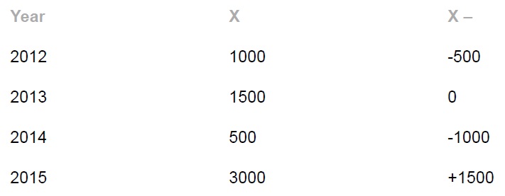
1. Sum up the values of all items or commodities. 1000 + 1500 + 500 + 3000 = 6000
2. Calculate the arithmetic mean (average) of the values. 6000/4 = 1500 Thus the arithmetic mean = 1500
3. Calculate the deviation from the mean of each value as shown in the table
below.
Deviation from the mean value
4. Plot the graph using the values of deviation from the mean; and remember to include the title and scale of the graph.
|
|
| Divergent Line Graph showing the Production of Commodities |
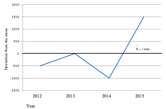
Advantages of Divergent Line Graph
1. It clearly shows how items fluctuate from the mean.
2. It compares the values of the items and hence facilitates a sound conclusion.
3. It shows both the positive (profit) and negative (loss) phenomena.
4. It is easy to construct, read and interpret.
Disadvantages of Divergent Line Graph
1. It involves many calculations and hence time-consuming.
2. It might be difficult to interpret if one lacks statistical skills.
3. It is applicable for only one item per graph.
B)BAR GRAPHS
A bar graph is also called bar chart or columnar graph. This method is used to present data which are not continuous. This means that in a bar graph there is no relationship between or among data.
Bar graphs emphasize individual amounts and their relative variations. When drawing such graphs, bar width in a graph is kept constant while bar lengths change in size as per the amount of the independent variable in question. Though the bars can also be drawn horizontally, they are usually drawn vertically. The bars should be separated from one another by a space.
Types of Bar Graphs
1. Simple bar graphs
2. Group or comparative bar graphs
3. Compound bar graphs
4. Divergent bar graphs
1.SIMPLE BAR GRAPH
A simple bar graph is drawn to show a single item per bar. It mainly represents simple data.Consider the data in the table below which shows the value of sisal exported by Tanzania between 1900 and 1993:
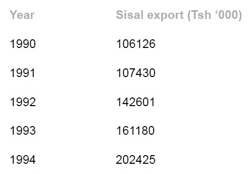
Construction
1. Choose the appropriate scale. However, note that the table below is not drawn to scale – it was drawn using the computer. All hand-drawn graphs must indicate the scale used. For, example, in our graph below, we might have chosen 1 cm to represent 10,000 tones, in which case we could obtain the values 5, 10, 15, 20 and 25 that we could have used to plot the graph.
2. Draw the axes and insert the bars. Note that all the bars must have the same width and spacing.
3. Shade the bars uniformly by using shade, lines, crosses, dots, etc.
4. Insert vertical and horizontal scales and the title.
|
|
| Simple Bar Graph showing Tanzania sisal export |
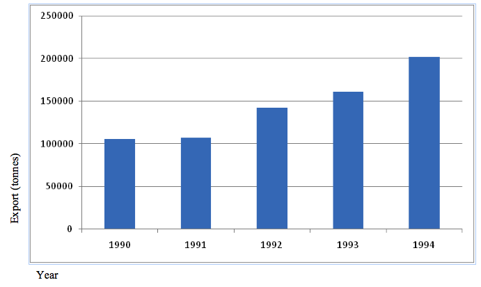
Scale: 1 cm to 50,000 tonnes
Advantages of a Simple Bar Graph
1. It is simple to construct, read and interpret.
2. It has a good visual impression.
3. It can be used to compare how the amount of an item varies from time to time.
Disadvantages of a Simple Bar Graph
1. It is limited to only one item or commodity and hence not suitable for massive data.
2. Not suitable for continuous data such as temperature.
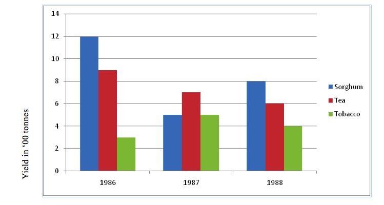
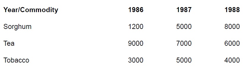
2.GROUP BAR GRAPH
A comparative/group bar graph consists of several bars drawn side by side on the same chart for the purpose of comparison. The technique involves grouping of bars in a chart. The graph can be used to show how production of certain commodities varies each year.
Construction:
The procedure for construction of the comparative bar graph is similar to that of drawing the simple bar graph except that the simple bar graph contains a single bar while the comparative bar graph comprises of multiple bars.
Consider the data in the table below, showing agricultural production in
metric tonnes.
The graph for the data is as shown below.
|
|
| Group (comparative) Bar Graph showing Crop Yields in ‘000 kg (1986 -1988) |
Advantages of a Group Bar Graph
1. The total values are expressed well for illustration of points.
2. It is easy to construct, read and interpret.
3. The importance of each component is shown clearly.
Disadvantages of a Group Bar Graph
1. It is difficult to compare the totals of each item/component.
2. Trends such as fall and rise cannot be shown easily.
3.COMPOUND BAR GRAPH
Compound/divided bar graph is a method of data presentation that involves construction of bars which are divided into segments to show both the individual and cumulative values of items. The length of each segment represents the contribution of an individual item in the total length while that of the whole bar represents the total (cumulative) value of the dierent items in each group.
Construction
1. Get the data needed for presentation. For example, consider the table below, which shows the number of tourists who visited the named Tanzania National Parks from 1998 to 2002.

2. Simplify the data (to make the presentation work easy) by dividing each value by 10,000. Then add the values to get the total for each year. The simplified data are as shown in the table below.
3. Determine the scale of the bar length based on the highest total value. In this case, the highest total value is 68 (20 + 20 + 10 + 18). Recall the construction of the compound line graph! If we choose 1 cm to represent 1 tourist (10,000 tourists in reality), then the length of the tallest bar will be 68 cm. Note that the maximum height of a graph for each year equals the cumulative total values for each year (i.e. 43, 46, 48, 59, 68).
4. Decide on the bar spacing, for example, 1 cm apart.
5. Draw the axes and label them.
6. Start by drawing bars that represent the highest values.
7. The first sets of bars to be drawn are those that represent the highest values. On top of these, the second highest segments are drawn. The last segments to be drawn are those with the lowest values in general.
8. To make it easy to follow the rise and fall of individual values, a soft line could be drawn across bars to separate individual segments.
9. Colour or shade the segments to improve the appearance and simplify interpretation.
10. Inset the scales, key and title.
|
|
| Compound (divided) Bar Graphs showing Tourist Visits in 0’000 (1998 - 2002) |
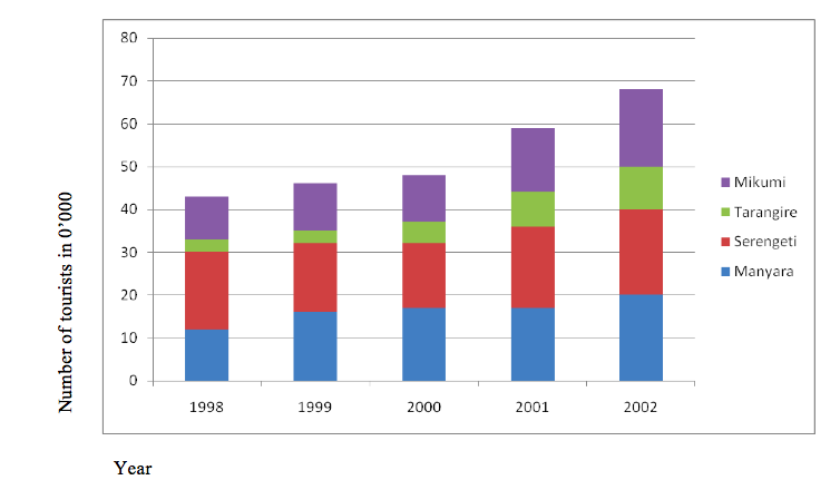
Advantages of Compound (divided) Bar Graph
1. It is easy to read and interpret as the totals are clearly shown.
2. It gives a clear visual impression of the total values.
3. It clearly shows the rise and fall in the grand total values.
Disadvantages of Compound (divided) Bar Graph
1. The values of individual segments above the first set are difficult to establish because they don’t start at zero. To get the correct values of the top segments, you have to add the figures, which is difficult for someone not well equipped with statistical skills.
2. The graph is very difficult to construct and interpret.
3. It is not easy to represent a large number of components as this would involve very long bars with many segments.
4.DIVERGENT BAR GRAPH
A divergent bar graph is a bar graph which shows how variables deviate from the mean.
Construction
1. Calculate the arithmetic mean (average) of the items.
2. Subtract the mean from each item.
3. Draw the graph using the resulting values.
4. Insert the scale and title of the graph.
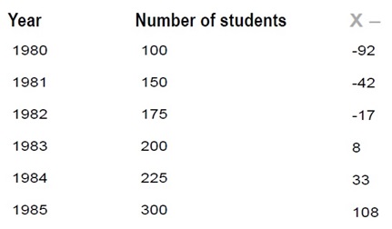
The data below show the enrolment of Form One students at Mara Secondary School from 1980–1985. Study the table and present the data by a divergent bar graph.
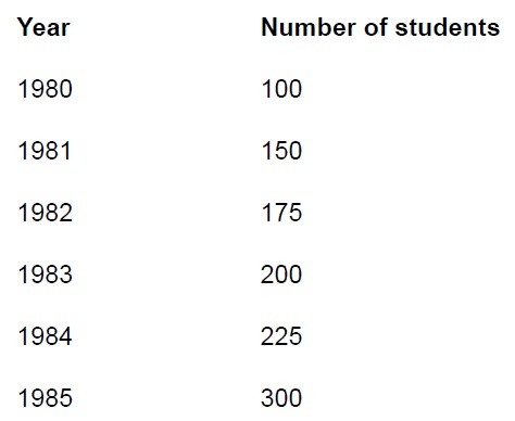
Procedure
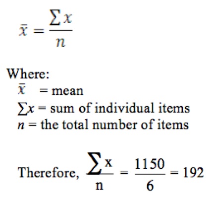
1. Find the arithmetic mean:
2. Subtract the mean from each item:
3. Choose a suitable scale and construct the graph using the obtained values (X – ).
|
|
| Divergent Bar Graph showing StudentEnrollment(1980-1985) |
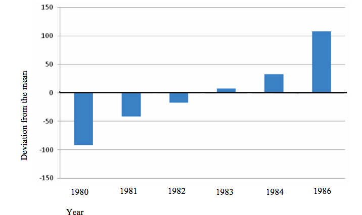
Advantages of Divergent Bar Graph
1. Fluctuation in values, which helps to detect the problem in general terms, is shown.
2. It is important for comparison of positives and negatives.
3. Profit (success) or loss (failure) can easily be deduced.
4. They are simple to construct, read and interpret.
Disadvantages of Divergent Bar Graph
1. Graph construction is time-consuming since it involves many steps.
2. The calculations involved may be difficult to someone who is poor at mathematics.
3. It is limited to analysis of only one variable.
5.PIE CHARTSORDIVIDED CIRCLES
A divided circle is also known as pie chart, circle chart or pie graph. The chart involves dividing the circle into “pie slices” to represent and show relative sizes of data. The size of each slice or segment is always proportional to the value it represents. Divided circles can appear in two forms:
1. Simple divided circles.
2. Proportional divided circles.
A simple divided circle involves a single set of data whereas the proportional divided circle involves more than one set of data such that the circles will be proportional to the total quantity that each circle represents.
SIMPLE DIVIDED CIRCLE
Construction:
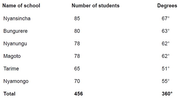
1. Obtain the data to work on. Study this hypothetical record showing enrolment of Form One students in selected Secondary Schools in Tarime District:
A table showing student enrolment in selected schools in TarimeDistrict
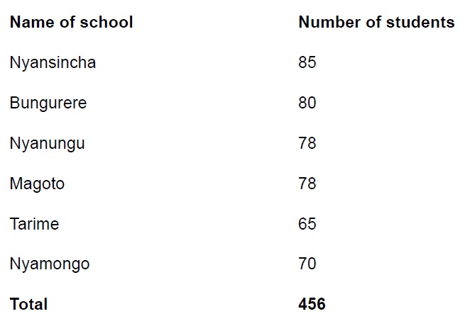
2. Calculate the total number of students as shown in the table.
3. Calculate the angle in a circle that would represent the number of students enrolled in each school. For example, 85 out of 456 students enrolled in Nyansincha Secondary School will be represented in the circle by a segment with an angle of 85/456 ×630 = 67 degrees.This will give the following results:
4. Draw a circle of a reasonable size.
5. Using a protractor, draw a radius from the 6 o’clock mark to the centre of the circle.
6. Starting with the largest segment representing a specific component, measure and draw its angle from the centre of the circle.
7. Do the same for other components in ascending order.
8. Divide a circle into segments according to the sizes of the angles.
9. Shade the segments and write the title and key of the drawn graph.
|
|
| Pie Chart/Divided Circle showing Student Enrolment in Selected Secondary Schools in Tarime District |

Advantages of Divided Circles
1. It is easy to compare components as they are represented by angles.
2. Analysis and interpretation of data is easy.
3. It is easy to assess the proportion of individual components against the total.
4. Construction of this graphical representation is relatively simple.
5. It is easy to determine the value of each component since it is indicated on each segment.
6. Visual impression of the individual components is clear and facilitates the understanding of the information in the data.
Disadvantages of Divided Circles
1. It is time-consuming because it involves a lot of calculations.
2. The represented actual values remain hidden as the values shown on the faces of the segments may be in percentages.
3. Where the range of data is large and involves small and big values, accurate construction of the chart is difficult.
4. When the values of data set vary slightly, it is difficult to visualize the proportional differences between values (as it is the case in the pie chart above).
The Importance of Statistics to the User
Statistics is important in geography because of the following reasons:
1. It enables the geographers to handle large sets of data and summarize them in a way that can be easily understood.
2. It can also enable the geographers to make comparisons between geographical phenomena, e.g. to compare the amount of rainfall and agriculture production or population distribution in different regions, etc.
3. Statistics translates data into mathematical ways which make the application of
quantitative techniques possible.
4. It enables the geographers to store the information in forms of numbers, graphs, tables, charts, etc.
5. Statistics give precise rather than generalized information. This offers a lot of satisfaction to the user.
6. Statistics is very useful for planning at local and national levels. For example, statistics on census can be used to plan for social services

Hub App
 For Call,Sms&WhatsApp: 255769929722 / 255754805256
For Call,Sms&WhatsApp: 255769929722 / 255754805256  Matokeo Darasa VII 2025
Matokeo KIDATO CHA II 2024
Matokeo Darasa IV 2024
SECONDARY REGIONAL EXAMS
PRIMARY REGIONAL EXAMS
FORM VI NECTA REVIEWS
FORM IV NECTA REVIEWS
FORM II NECTA REVIEWS
STD VII NECTA REVIEWS
STD IV NECTA REVIEWS
SECONDARY EXAMS SERIES
PRIMARY EXAMS SERIES
PRIMARY SUBJECT NOTES
SECONDARY SUBJECT NOTES
SECONDARY TOPICAL EXAMS
SECONDARY TOPICAL QUESTIONS
PRIMARY TOPICAL QUESTIONS
PRACTICAL EXAMS & NOTES
SECONDARY REGIONAL EXAMS
DOWNLOAD SUBJECT NOTES
SCHEMES OF WORK (PRIMARY & SECONDARY)
LESSON PLAN
SECONDARY LOG BOOKS
PRIMARY LOG BOOKS
LITERARY WORKS / UCHAMBUZI VITABU
METHALI ZOTE ZA KISWAHILI
Vitendawili Vya Kiswahili
FORM VI RESULTS 2024
FORM FIVE SELECTION 2024
MATOKEO KIDATO CHA IV 2023
FORM ONE SELECTION 2024
FORM VI RESULTS 2023
Matokeo Darasa IV 2022
Matokeo Darasa VII 2025
Matokeo KIDATO CHA II 2024
Matokeo Darasa IV 2024
SECONDARY REGIONAL EXAMS
PRIMARY REGIONAL EXAMS
FORM VI NECTA REVIEWS
FORM IV NECTA REVIEWS
FORM II NECTA REVIEWS
STD VII NECTA REVIEWS
STD IV NECTA REVIEWS
SECONDARY EXAMS SERIES
PRIMARY EXAMS SERIES
PRIMARY SUBJECT NOTES
SECONDARY SUBJECT NOTES
SECONDARY TOPICAL EXAMS
SECONDARY TOPICAL QUESTIONS
PRIMARY TOPICAL QUESTIONS
PRACTICAL EXAMS & NOTES
SECONDARY REGIONAL EXAMS
DOWNLOAD SUBJECT NOTES
SCHEMES OF WORK (PRIMARY & SECONDARY)
LESSON PLAN
SECONDARY LOG BOOKS
PRIMARY LOG BOOKS
LITERARY WORKS / UCHAMBUZI VITABU
METHALI ZOTE ZA KISWAHILI
Vitendawili Vya Kiswahili
FORM VI RESULTS 2024
FORM FIVE SELECTION 2024
MATOKEO KIDATO CHA IV 2023
FORM ONE SELECTION 2024
FORM VI RESULTS 2023
Matokeo Darasa IV 2022
WHATSAPP US NOW FOR ANY QUERY
App Ya Learning Hub Tanzania